Conference season is approaching with Blogger events popping up all over and there are a few things you should do to be prepared!
Aside from choosing a new pair of (super) comfy but deadly sexy shoes, your next more important asset is the BUSINESS CARD.
Your goal at a conference is to connect with both Bloggers and Brands. You want to land yourself in the brands inbox to be on the list for future opportunities, and you want to give the bloggers you bond with a way to tweet you, mention you and find you after (or sometimes during ) the conference event.
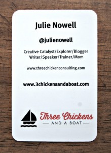
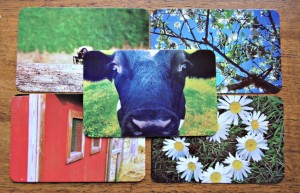
My last set of cards looked super pretty, and peeps loved the rounded corners and heavy stock paper, but I made a few mistakes.
First of all, I forgot my email address on the card. I don’t know how I did it, but it happened. And honestly, every time I hand one out and tell them my email addy verbally, I feel like a total loser.
So #1 point. REMEMBER ALL THE IMPORTANT INFORMATION
Email! Twitter! WebPage. NAME!
I know, it seems like a silly thing to include, but it is so easy to forget. Make a list of all our details, and the ones you want/need in there BEFORE you start building your card via an online site.
Also, I went gloss on these cards. It made the pretty images stand out but was a NIGHTMARE for peeps who wanted to write a note on the card about how we met (and trust me, this happens ALOT) Next time, I will go matte.
Finally, I had to pay a pretty penny to customs before I could claim them, and that hurt the piggy bank!
A lot.
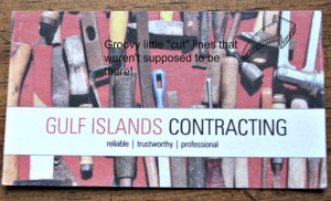
We have multiple business (5 actually) that need print material and so we have been trying to find “our place” to make purchases. We had purchased product from VistaPrint in the past, but had a lot of difficulty unloading our own images to the cards and ended up with this groovy “cut line” around the edge.
Twice

This would be another important fact, find somewhere that has a variety of template options, or has an EASY upload feature. The last thing you want to have happen is for your cards to arrive JUST-IN-TIME and be all wrong.
I am excited about trying something new with YouPrint site– it seems easy to use and has all the features available that I like in Biz cards.
So, to help you prepare, here are my main tips for business cards for conferences!
1. Make it bright and simple and easy to read. Try not to clutter in too much information. Name, email, social handles (if you are a blogger) and URL
2. Don’t do a white back of the card- I know, I know, people may want to “write” on them…but leave them room to write on the front! Make the back bold and aggressive and fill it with your logo, your mantra or anything else that will help it stand out in a crowd of cards
3. Use nicer paper! If you can upgrade the paper, do it! It is always worth the investment to go with a heavier card!
4. Don’t go gloss (see #2) People may want to write on a business card and record a few details of your meeting! If your cards are gloss, this is a nightmare!
5. Order enough! You don’t want to be holding back on handing out a card, so be sure to order a pck of 150-250 min for a conference. You want to ensure that every blogger you CONNECT with has your deats, as well as every brand! Again, remember, your plan is to get your email addy on the brands list- best way is through your card!
I don’t do a media kit, or a postcard. I commit to the business card and my brain for selling myself and making connections. And at night when other bloggers may be hitting the wine bar an hour early, I spend that time email, following and supporting the brands I am loving!
So, go forth Bloggers and build your business card. Make it pretty/sexy/bold and include all the right info! And then at your conference let it rain your card! Share your name and then follow up with the cards you get . . THEN you will be in business.


